22.06.2017 by Anete Ezera
We have all sat through boring data presentations. You might even be guilty of sharing a lack-luster data story in the past. That’s because presenting data in a way that is compelling and memorable can be tough.
The good news is that putting together a presentation with data isn’t as hard as you think. It’s all about extracting key insights, designing effective visualizations, and telling a great story. Infogram and Prezi teamed up for a webinar full of fun visuals and advice.

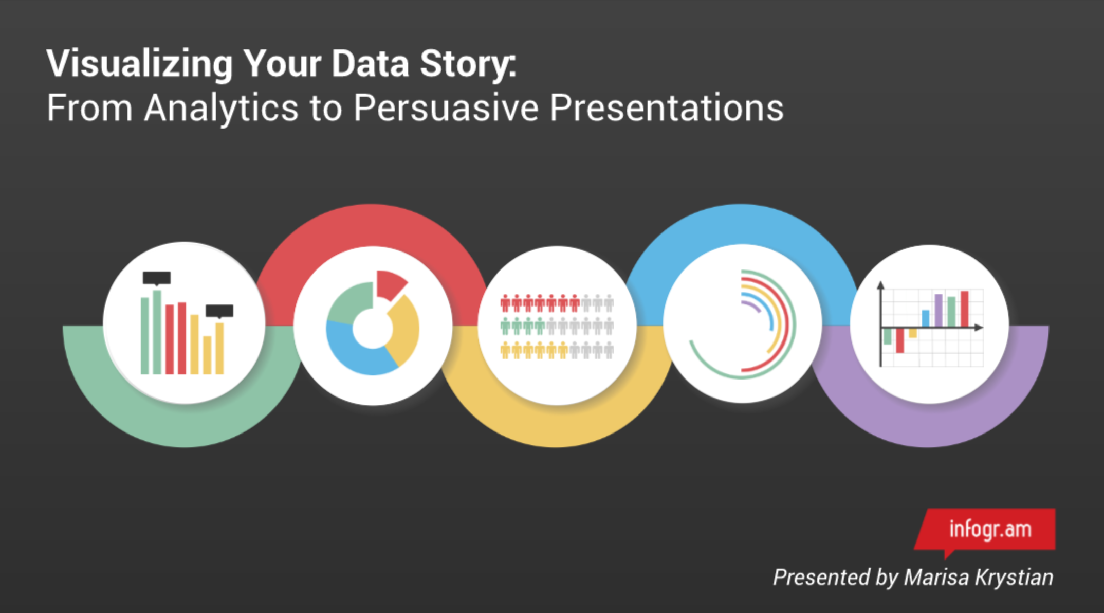
Visualizing Your Data Story
The webinar explains how to create visuals that are easy to understand, how much data to include in your presentation and the best way to engage your audience.
Why is it important to learn how to present data? Because your data has a story to tell, and when you present data in charts and maps it becomes easier to read and remember. You want to create a presentation people will be talking about tomorrow.
You’ll Learn How To:
- Use color and clear labels to highlight your best data
- Add icons and imagery to grab your viewer’s attention
- Provide context in order to tell a powerful story
- Follow company brand guidelines to look more professional
- Break down complex visualizations for easy reading
- Present to a group, not just report the facts
- Avoid common data presentation mistakes
This may seem like a lot to think about, but it only takes a little time to look at your data and plan what you’d like to say. Tools like Infogram and Prezi make designing and presenting your data story a snap. Click the link to view the webinar, ‘Visualizing Your Data Story – From Analytics to Persuasive Presentations.’
Get data visualization tips every week:
New features, special offers, and exciting news about the world of data visualization.