16.03.2016 by Anete Ezera
Data visualization is a powerful tool that helps both scientists and the public quickly understand the scope and context of complex health threats, which is why science maps are the focus of the CDC Museum’s latest fascinating exhibit.
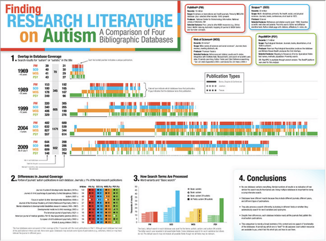
The Places & Spaces: Mapping Science exhibition has collected maps and visualization tools from leading experts in the natural, physical, and social sciences, as well as government and industry, for the past 10-years. Each year, a new theme is chosen and 10 new maps are added resulting in over 100 maps total. The museum hopes to help audiences grasp complicated, abstract concepts and relationships with data visualizations in order to promote informed, effective decision-making.
Let’s explore the relationship between science and data visualization and take a peek at a few of the new exciting maps on display.
Data Visualization and Science
Maps and data visualizations are used to help CDC scientists merge old-fashioned detective work with high-tech science in order to solve health mysteries. Advances in technology and public health data collection have made it easier than ever before to analyze and display data.
Places & Spaces: Mapping Science curator, Katy Börner, explained the importance of data visualization in the modern era:
“In the information age, being able to ‘read and write’ data visualizations is becoming as important as being able to read and write text. The visualizations displayed in this exhibit showcase the power of data visualizations to save lives, to make decisions informed by high quality data, and to communicate the beauty and value of science to a general audience,” said Börner.
Public health leaders and citizens need the best information to make better decisions, faster. Today, maps and data visualizations are essential to CDC’s efforts to prevent disease, prolong life, and promote health.
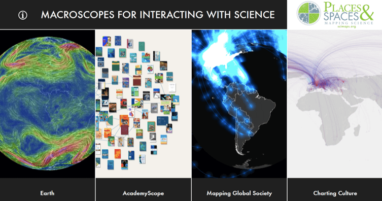
The Places & Spaces series encompasses all science related fields, not just health. This year’s exhibit is the 11th iteration of Places & Spaces: Mapping Science, featuring macroscopes.
Macroscopes
While the last decade has been mainly devoted to static maps of science, the next decade’s mission will be devoted to exploring the power and potential of macroscopes.
Much like microscopes and telescopes, macroscopes allow us to see objects that would otherwise not be perceived by the naked eye because they are too small or too distant. The term ‘macroscope’ refers to software tools that help people see patterns in data that are too large or complex to see unaided.
They are interactive in nature, helping anyone visually explore data and see the ‘bigger picture.’ The exhibit features a large high-tech touchscreen where visitors can engage and interact with each visualization.
New Maps on Display
Macroscopes have great potential as tools for exploring, understanding, and communicating science. They empower individuals to interact with data and even make their own maps.
Let’s dive into a selection of maps on display at this year’s Places & Spaces: Mapping Science exhibition:
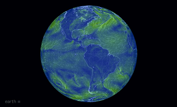
Earth
Track wind speed, temperature, pollution, and weather patterns in real time and worldwide with Earth, the work of software engineer Cameron Beccario.
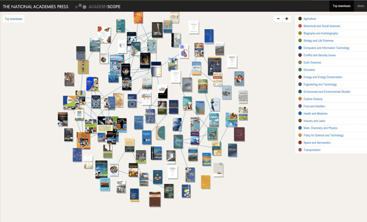
AcademyScope
Organize 20 years of reports from four major research institutions, grouping and arranging them based on topics, popularity, and publication date, with AcademyScope. This amazing visualization represents a collaborative effort between the National Academy of Sciences and Indiana University’s Cyber infrastructure for Network Science Center.
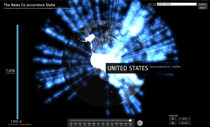
Mapping Global Society
Illustrate connections between countries based on local news stories in more than 100 languages. This macroscope was created by Kalev H. Leetaru, an expert on big data and global society.
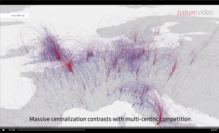
Charting Culture
Chart the movements of people and changing cultural influences by tracking the birth and death locations of 120,000 individuals over the past 2,600 years. University of Texas art historian Maximilian Schich and Mauro Martino, head of IBM’s Watson Cognitive Visualization Lab, created Charting Culture, which debuted in August of 2014 and went on to accumulate over 1 million views on YouTube.
The CDC Museum features award-winning permanent and changing exhibitions that focus on a variety of public health topics, as well as the history of CDC. You can visit the Places & Spaces: Mapping Science exhibition for free until June 17, 2016. So, if you’re in the Atlanta area, you have a few months to visit and admire the featured works for yourself!
If you like learning about data visualizations, follow our blog and sign up for the weekly Infogram newsletter for charting tips and the latest news on the dataviz community.
Get data visualization tips every week:
New features, special offers, and exciting news about the world of data visualization.