29.03.2016 by Anete Ezera
Color can grab people’s attention, set the mood, and influence perception. There are multiple free tools online to help you discover great color palettes, but finding the right colors for your data visualizations can be tough.
Using color effectively can enhance the way your charts and graphs communicate data. That being said, color used incorrectly can muddle or confuse the viewer. Let’s go over basic color theory and the ‘do’s and don’ts’ of charting with color.
Color Variables
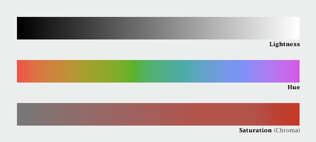
We tend to refer to colors by their name, but color perception is more complicated than that. Some colors are lighter, darker, richer, more vibrant. Our brain views color in terms of lightness (black to white), saturation (dull to bright), and hue (red, orange, yellow, green, blue, purple.)
These three variables, originally defined by Albert H. Munsell, are the foundation of any color theory system based on human perception. Now it’s up to you to effectively use color to help illuminate your data.

DO:
- Use one color to represent continuous data – Representing continuous data and ranges by varying the saturation or value of a color makes you chart straightforward and easy to read.
- Use contrasting colors for comparisons – Contrasting colors help the viewer differentiate the data quickly (e.g. profits and losses).
- Use colors that appear in nature – People respond better to colors they are familiar with; colors that appear naturally in the world around them.
- Use branded colors for marketing materials or presentations – Customizing your data visualizations to match your company’s color scheme helps you align with your brand and keeps your messaging consistent. It also helps with brand recognition.
- Use color to highlight your most important information – Color can be a great way to guide the viewer’s eye to key points on your chart. We suggest using muted colors with one bright color to bring attention to your most important information.
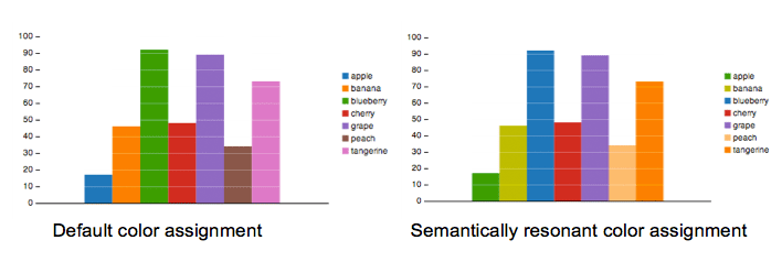
- Experiment with semantic color associations – People associate certain concepts with certain colors. When colors are paired with the concepts that evoke them, Harvard Business Review calls these “semantically resonant color choices.” The charts below showing fruit sales are identical except for their assigned color scheme. The right-hand chart has been assigned semantically resonant colors and according to HBR’s research, people understood the chart faster.
- Consider the psychology of color – Different colors make people feel different things! Take this into account when picking colors for your data visualization.
Source: Visually
DONT:
- Pick colors that are too hard to distinguish – It’s important for your viewer to be able to understand the data you are presenting. If they need to quickly make comparisons, the colors need to be easy to distinguish.
- Use too many colors – Try to avoid the rainbow effect! Less is more. Make sure the colors you choose have a purpose and make your chart easier to read, not harder.
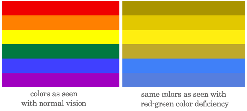
- Forget some people are color blind – Avoid the following color combinations, which are especially hard on people who are color blind: green & red; green & brown; blue & purple; green & blue; light green & yellow; blue & grey; green & grey; green & black.

Ready to experiment with color theory and data visualization? Infogram makes it easy to select the perfect color palette for your charts. We offer pre-designed color schemes for you to explore, but you are more than welcome to select any colors you’d like.
Get data visualization tips every week:
New features, special offers, and exciting news about the world of data visualization.

